Make the Web a More Colorful Place!
A guide to using new color spaces & formats with OddContrast
OddBird’s color tool not only checks contrast ratios, but supports the new CSS color formats and spaces.
It’s important to focus the conversation
Beautiful design mockups can be distracting, giving a false sense of what is complete and what still needs to be done. At OddBird, we find it helpful to remove any ‘premature sheen’ before sharing mockups with clients.
Jeremy Keith (co-founder of Clearleft, and long-time open-web advocate) recently shared a New York Times interview with (musician) Brian Eno. We’re reaching Inception-levels of quotation here, I know – but in that interview, Brian quotes from an architect friend (Rem Koolhaas), talking about the introduction of computers:
You could construct a building in half an hour on the computer, and you’d have this amazing-looking thing, but, he said, “It didn’t help us make good buildings. It helped us make things that looked like they might be good buildings.”
Koolhaas refers to this as a ‘premature sheen’ that software can add, distracting from the real questions at hand early in a project. It’s easy to make something look good, before you’ve confirmed that it works.
Jeremy makes an apt analogy to generative models today, but I think this idea is useful to consider when communicating with clients, no matter what tools are involved.
As designers and developers we are constantly immersed in the creative process. We (hopefully) understand the steps that a new project has to go through from idea to execution. It’s not a straight line, but requires cycles of experimentation and editing, prototyping, sketching, drafting, and polishing.
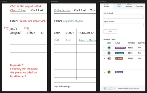
When I review a design concept, I know where we are in that process – and it changes the kind of feedback that I give. If we’re early in the process, I’m going to ignore issues like typographic kerning, and focus on overall approach. Does the concept work? If I received a similar mockup later in the process I’d review it differently – is every detail in place?
I don’t mean that designers are actually sending me the same document at the start, and again later in the same process. But that when they send me a mockup, I know from experience how to focus on the currently-relevant aspects of the design, and set aside questions that we’ll get to later.
I also know that as a designer, it can be helpful to work at a higher level of fidelity – even when sketching rough ideas. Design is always contextual, so providing a rough font-and-color palette might tell you something about the layout that you wouldn’t see in a napkin sketch. That ‘premature sheen’ can be useful, if you know what you’re looking at.
But we’re only able to do that because we’re all familiar with the process. Most clients and stakeholders on a new project don’t have that same level of experience. If we show clients a highly designed mockup, they will consistently focus on the details like colors and fonts, even if we’re asking higher level questions about content and layout. And since the web is fundamentally responsive and interactive, no static mockup is ever complete. We know that, but clients often find that hard to understand.
We don’t think that’s a reason to avoid mockups entirely. A mockup of the site in a specific state can be a helpful tool for our internal process. But we know that a mockup with ‘premature sheen’ – a mockup that looks too good – can quickly become distracting or misleading for clients.
Over the years we’ve developed an approach to avoid showing clients any mockup that looks more complete than it is. Sometimes that involves removing the colors with a grayscale filter, or changing all the fonts to something off-brand, or scribbling notes on top of the design to obscure the detail.
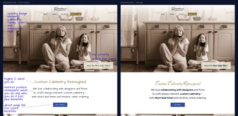
We want to help clients focus on the right questions at the right times. And to do that we remove any ‘sheen’ that’s even potentially premature.
Show clients something ugly, so they know what they’re looking at.
A guide to using new color spaces & formats with OddContrast
OddBird’s color tool not only checks contrast ratios, but supports the new CSS color formats and spaces.
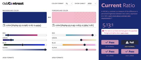
Display color gamut ranges and more
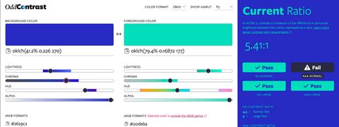
OddContrast, OddBird’s color format converter and contrast checker, gets new features – including the ability to swap background and foreground colors, and display color gamut ranges on the color sliders. Contrast ratios now incorporate foreground color alpha values.
Miriam Suzanne, Stacy Kvernmo, and James Stuckey Weber demo how to use new color formats with OddContrast, a color tool for previewing, accessibility testing, and selecting the format/space.